
What Makes a Great Book Cover
Master book designers explain why these are some of the best covers of all time.

 Have you ever bought a book for its cover? Maybe not. But chances are a cover has captured your attention, leading you to pick it up and scan the first few pages to see if you’d get hooked. Even if you can’t pinpoint the reasons for the appeal, there’s something about a well-rendered cover that seems fresh, witty, and full of substance. If you ask book designers to explain what makes for a great cover, however, they can tell you about how the various design elements—the typeface, the color scheme, and the composition—come together to create a visual metaphor for the text.
Magenta asked 15 book designers to nominate the best covers that they hadn’t created themselves. In describing their choices, most of them showed a keen appreciation for simplicity—one gobsmackingly clever idea executed with awe-inspiring skill.


I love this jacket’s starkness, its obvious humor, the insouciant title typography paired with Glaser’s elegant scrawl-script. There is an obvious tension between the illustrated forms, the colors as ideals, and after staring at it for some time, the blonde wig becomes insidious, suddenly prehensile atop the anonymous head. As with the simplest designs, meanings grow and evolve, often beyond the original intent. Additional subtlety and context are introduced over time. This jacket has certainly aged well.


Book-jacket designers are typically constrained by lean budgets, so the opportunity to think ‘outside the rectangle’ is rare and thrilling. In 2014, Helen Yentus dreamed up a special edition 3D slipcase for Chang-rae Lee’s futuristic novel, On Such a Full Sea. Made in collaboration with the MakerBot Studio, Yentus used a 3D printer to bring genuine dimension to her layout — stretching Paul Renner’s 1927 geometric Futura letterforms to their max. More often than not, cover designers are obliged to create these sorts of illusions in two dimensions, so to see how Yentus achieved this with an inspired half-slipcase, one that leads the eye seamlessly from the flat surface of the book’s cover to the sculptural, monochromatic case, reminds us that while this effect would of course be easily achievable on-screen, this tactile version is oh so much more satisfying — and covetable.


In 2015, I was lucky enough to visit an exhibition celebrating the artwork of Dick Bruna at the Rijks Museum in Amsterdam. I had long been a fan of his Miffy character but hadn’t fully appreciated the extent of his other works, most notably the vast array of book covers (more than 2,000 in total) he designed and illustrated. One series that caught my eye was for the crime writer Havank, depicting the smoking French police officer Charles C.M. Carlier in various scenarios, all drawn with Bruna’s signature simplicity and wit. I love the repetition of this character and how, with only the smallest of adjustments, he created such a bold and recognizable series style. Mystery on Majorca, where he’s carrying a large fish under his arm and wearing a sun hat, particularly makes me smile.


I’m a sucker for witty, simple, powerful ideas, and this is just a perfect example of that. Less being more, all David did was use Penguin’s original paperback grid, a classic in its own right, and censor the title and author with black foil. If you’ve read 1984, you’ll know about the Ministry of Truth and its antics. This nods to that beautifully and is a testament to good design and art direction in an evermore commercial book-publishing environment. Cover design like this pushes back and helps to safeguard the future of the book as an object to covet rather than just media to consume.


Ira Glass, during a special episode of This American Life about humorist David Rakoff, said, “Great stories happen to those who can tell them.” I would take that idea a step further to say that great titles happen to those who can design them. Chip Kidd’s blasphemous scrawl defacing the title of David’s book of essays made Fraud better… palpable, funny. David and Chip were friends in real life, and I like to think of them together when I look at this cover. If you haven’t read Fraud, which I have a few times, you have something to look forward to—an evening with a great storyteller.


When I first encountered Paul Bacon’s 1969 cover of Slaughterhouse-Five, I was baffled. As a huge fan of Vonnegut as well as narrative-based design, I couldn’t work out why it resonated with me so much yet seemed to convey so little of the book itself. Simple, type-led, and driven by shape (tombstone? doorway?), this is a perfect example of how you can create a cover that is both apt and beautiful without telling the viewer a damned thing about the story, just by intriguing them and creating an identity for the book. And the spine is great, too.


I don’t actually have an all-time favorite book cover; it changes too often and is different for each genre and context of the book. As a rule, though, I tend not to be drawn to “pretty” covers but the ones that actually make you see, think, or feel differently. And if it happens to be beautiful, too, like this one, then it becomes fairly memorable. I like its cleverness of it: Depending on which colored filter you choose to look through, it shows a different illustration. I’m drawn to its complexity and simplicity at the same time. Plus, I like a bargain — getting three in one images is ingenious—and it brings out the playful kid in me.


I didn’t want to pick a Chip Kidd cover; he’s become so (deservedly) ubiquitous and done so many acclaimed covers that it’s too easy. But I gotta be honest. I saw this cover shortly after moving to Minneapolis to become a real designer, and it blew me away. I didn’t know you could DO that stuff…the condensed sans coupled with the vintage script… the weird layout… the color palette… the wonderful illustration… that fiery hair. It had a retro vibe but still felt so fresh. When I saw it, I thought two things: I want to be a designer, and I want to design book covers. (And if I’m continuing to be honest, I also had a third thought: I’ll never do anything that good.)


If you ask me who my favorite book jacket designer of all time is, it’s Alvin Lustig. If you ask me which of his jacket designs is my favorite, it’s impossible. It’s most certainly one of the jackets he designed for New Directions’ New Classics. Lustig essentially branded the New Direction series with a modern look that was reminiscent of what was going on in the fine art world. It’s as if he translated a Calder sculpture or a Joan Miro painting into a book cover. Each book is reduced to color, line, shape, and type to reflect the feel of the book rather than the literal content. The geometric shapes, the bold color palettes, the freeform lines still feel modern today.


I am in awe of this cover for its simplicity and powerful material quality. The title was painstakingly pinpricked by hand through heavy card stock and then photographed to become the cover. The physical process used to create the image infuses the word “obsession” with an incredibly visceral feeling. When I look at this cover, I immediately imagine the ache that Lauren Nassef must have felt in her thumbs after pressing the head of the pin through the card stock so many times. The designers embraced a seemingly simple material and process to communicate the complex, total-body experience of obsession at first glance. The result is a concise and stunning image with a tremendous visual-verbal connection.


I love the juxtaposition of the book’s title with the photograph by one of my favorite photographers, Garry Winogrand (the photo is World’s Fair, New York City, 1964), picturing six white women sitting a bench. On the far left sits a young black man talking to a white woman. The two are engaged and immersed in each other. The three girls at the center are embracing and whispering, while two other girls look at something off the frame. On the right side, an elderly white man is reading a paper. It’s a fascinating composition, and I like the sensitivity, inclusiveness, and beauty in it.
The design is so simply executed — the straightforwardness is what I find so smart. The black background and capitalized Jean Luc type in white and yellow gives the design more punch; it demands attention and almost reminds me of a punk album. I always love a boxed art design and think giving an image a frame can bring it more into focus. The sharpness and edges in the composition, the primary colors, the bold type, the image — it’s so satisfying.


Years ago, I was working on a cover and spine treatment and the only part that really “worked” was the spine design, so I plunked it in the middle of the front cover and called it a day. David Pearson’s cover for The Work of Art in the Age of Mechanical Reproduction takes this idea and improves on it exponentially, producing a cover that is conceptual perfection. One of those ideas that only seem obvious once someone else has done it.
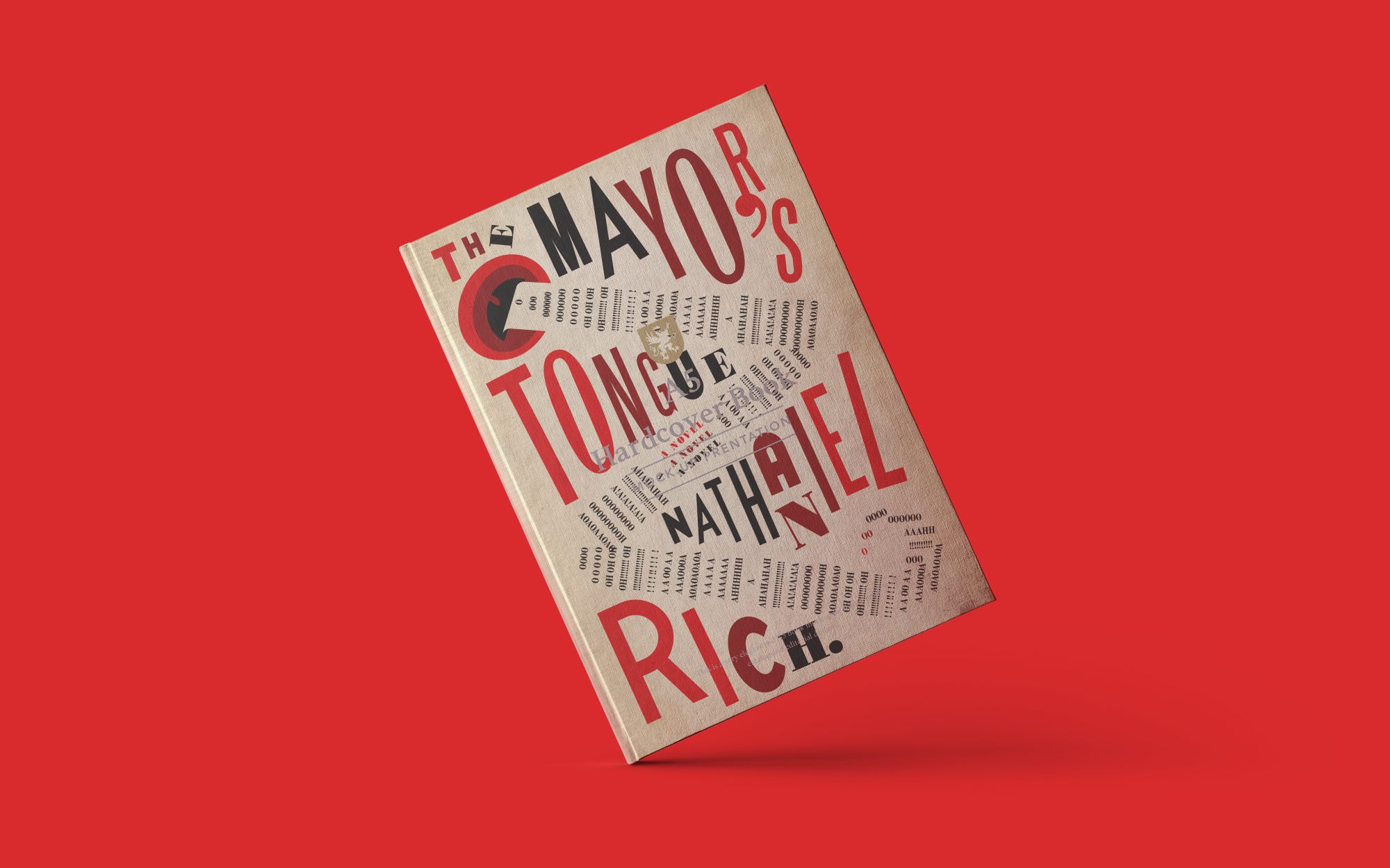

This cover has got everything you could ever want — a great collection of typefaces, a lovely color scheme that fades from red to black and back to red again, an amazing zigzag structure that just about holds everything together. And it manages to look simultaneously like a piece of art and a really commercial cover at the same time.


One of the great pleasures of designing a book cover is the opportunity to connect an author’s work to the existing work of a visual artist — to find shared interests across disciplines. For this 1997 cover, Chip Kidd connected a contemporary translation of The New Testament to the work of photographer Andres Serrano, a fearless choice that at once kicked ancient scripture into the present day and brought historical context to Serrano’s controversial photograph from 1992. Above the image, understated (almost generic) type delivered this gruesome and well-known chronicle with either respect or dispassion — wisely left for the reader to decide.


After I graduated college, I worked for many years in bookstores. I spent every day organizing books and subconsciously memorizing their covers and titles. After spending day after day making displays, I began taking notice of certain designers whose covers I naturally gravitated toward and always wanted to face out on displays. One of these designers was John Gall. I loved that his covers played spatially with the format he was given. They ranged from collaged flat images to photographic ones with shadows and depth. I particularly remember this cover because I rarely enjoyed covers that were in the philosophy section of our store, but when I came upon this one, I loved it so much. It was so clever, it had a sense of humor about a heady topic, and most intriguing to me, it didn’t look the way most of the other book covers did. I remember facing it out in our philosophy section constantly, and it never stayed on the shelf for long.
Magenta is a publication of Huge.

